Redesigning Stuntbox, COVID-19 Edition

Earlier this year I started a slow reworking of my site, pushing out the first tweaks before COVID-19 hit U.S. shores and reordered all our lives. But I’ve kept at it, tinkering and refining, and somewhere along the way it’s added up to a redesign.
I didn’t have grand plans at the outset, but I did have some goals:
- Lower the psychological barriers to posting more often.
- Create better ways to house my “photo stuff” alongside my “word stuff.”
- Try out some new front-end fancypants-ness (i.e., CSS Grid Layout and custom properties).
- Fiddle with the site’s aesthetic, as we design types are wont to do.
Little Burdens
The first change was to eliminate the need for posts to have a title. Sounds basic when I write it out like that, doesn’t it? Requiring titles on shorter, more casual posts has always been an obvious drag on my workflow. Yet most of the publishing tools I’ve used don’t make this as painless as it should be.
My favorite anecdote about this comes from a public forum I attended a few years ago. Two well-known authors were talking about writer’s block, and all the little ways you can get sidetracked. At the time, Google Docs required you enter a title for new documents right after creating them—and before you had a chance to write a single word. One of the authors remarked on the absurdity of it: “I don’t even know what I’m going to write yet!”
Teaching a CMS to not create the same kind of stumbling blocks can be tricky. Enter Jekyll, the software I use to build this site.
Jekyll lets you create layouts that don’t require a title, but still makes you enter one in the filename of your entry’s Markdown file. You could enter a placeholder like foo or go-away-stop-bothering-me, but it will get used in places you don’t want, like the title element of your HTML.
To get around this I created a helper function in Liquid, Jekyll’s templating language. It checks when I haven’t entered a title in the content of a post, and returns the post’s date in a variable instead. Then I can use that variable anywhere in a template where a title value might be needed. That keeps Jekyll from using the unwanted-but-required filename stuff. It looks a little something like this:
{% case page.layout %}

    {% when 'post' %}
        {% if page.title != "" %}
            {% capture custom_page_title %}
            {{ page.title }} – Stuntbox
            {% endcapture %}
        {% else %}
            {% capture custom_page_title %}
            {{ page.date | date: "%B %e, %Y" }} – Stuntbox
            {% endcapture %}
        {% endif %}

    # Add special cases as needed (based on layouts)
    {%- when 'archive-category' -%}
    {%- capture custom_page_title -%}
    All {{ page.title | capitalize }}s – Stuntbox
    {%- endcapture -%}

    # Fallback if no cases match
    {% else %}
    {% capture custom_page_title %}
    {{ page.title }} – Stuntbox
    {% endcapture %}

{% endcase %}

# Use variable in template wherever title is needed:
<title>{{ custom_page_title }}</title>
The next thing to tackle was the layout of the homepage. Previous versions of the homepage displayed the full content of recent posts right on the front of the site. It got straight to the point with the reader, but created limitations. Any visual experiments I did with entries had to be compatible with the design of the homepage, too. And because the content of each entry was so prominent, it made me self-conscious about what was displaying on the front of the site. If I posted something I was proud of I was loath to see it get bumped off the page by newer entries. On the other hand, if a post felt like less of a big deal I was eager to hustle it away.
I’ve done away with that setup. Posts are still displayed on the homepage, but only their titles along with a smidge of supporting info (or a thumbnail image in the case of photo posts). I also created a featured tag to let me pin posts I want to keep around, and a suppress tag for when I’d rather they skip the homepage altogether. I also went a step further recently and added a feed-only setting for when I’m feeling a little RSS Club. These are all front matter options I’ve taught my site templates how to handle. And lest things get complicated, I now have an archive page that lists everything I’ve posted to this site in a single view, going back to the very first entry I published over 15 years ago.
I don’t expect to use these settings much, but it’s a welcome thought to know they’re there. As with the option to publish entries without a title, this is all basic stuff. But it lifts burdens. There’s a bit of oft-repeated advice that instructs creative types to, “dance like no one is watching.” These changes help get rid of some reminders that I’m in front of a crowd.
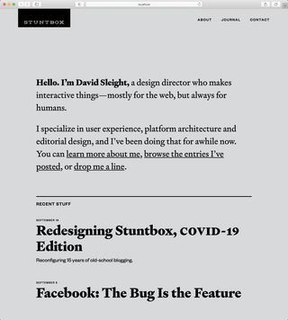
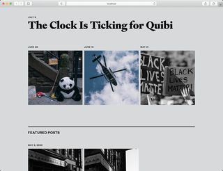
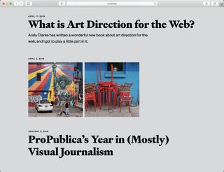
The reorganized homepage, greatly simplified.
While I was at it, I also wanted to renew this site’s role as a personal hobby space.
Like many others, my use of Flickr has waned as the once-beloved service has grown stagnant. People often point out how Flickr missed the boat on mobile. But I also lament that they never picked up on opportunities for more narrative presentations, like photo essays, and other places where they could have blurred content boundaries and expanded their appeal.
So I started reviewing my old posts there, as well as on Instagram and other services, and thinking about how to bring the material I value the most over here. That gave me another useful way to lower the barriers to posting more often: existing content. Pulling in this other material gives me something to work with when I’m staring at a blank page or might otherwise feel a little stuck.
This work is ongoing. Some images I’m adding to the site according to their original publish date. Others I’m resurfacing as new posts or expanding with more content. How much and when depends on how I feel. Now that I have better options, it’s been fun to return to old posts and “remaster” them (to borrow a term from music production). Revisiting these entries is also helping me think of them as part of a larger body of work—a whole thing—rather than a series of disconnected entries.
Visual Design
To support all this I needed to make some design changes. To keep that from getting overwhelming, I wanted to create a few fixed points as soon as possible. This time I started with typography and color.
Like many typophile designers, I’ve developed well-worn habits for selecting typefaces. Regardless of the brief or the aesthetic, they often steer me towards locating a good pairing of at least two faces for titles and body text—typically a serif and a sans—with compatible x-heights and weights. But this time I threw that out and focused on using a single anchor typeface for everything.
That wasn’t my original intent, but early on I picked Tablet Gothic from TypeTogether as a titling face, and was surprised at how well it covered my needs. It’s a sturdy grotesque with a bit of a Franklin Gothic feel that’s inclined towards headlines. But I found it wasn’t half bad for body copy, code examples, and other bits of supporting text. So I stuck a pin in it.

As for colors… what colors? I stripped the palette from the site and went with basic black and white.
I can get lost for hours fiddling with type and color. Setting early, usable baselines for both freed me from getting too distracted while I rebuilt layouts and worked on other bits of the site. It also let me get enough of a feel for the personality of the updated layouts that when a more nuanced fit came along I was ready to pounce.
That opportunity arrived in late August when Klim released Signifier. They call it a “Brutalist response to 17th century typefaces,” and I like to think of it as one of those typefaces with “just the right amount of wrong.” Its quirkiness belies the fact that it is a darn handsome typeface to set body copy in, and has some fun forms that can strut their stuff at larger title sizes without overwhelming the text. Paired with Founders Grotesk, another Klim face with a touch of quirk to it, I had my final type choices.
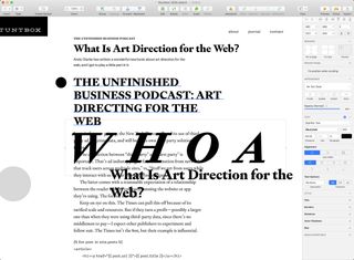
Credit to Klim for making test versions of their fonts available for download. I wish more foundries would do this! Mocking things up using screenshots from sample galleries only gets you so far. When you’re building type for the web, there’s no substitute for getting real fonts into the browser and working with them in their intended context.
As a side note, halfway through this work I got time to read Flexible Typesetting, Tim Brown’s excellent entry to the A Book Apart series. It exceeds its mandate as a book about web-based typography, with guidance on the fundamentals of typesetting that’s practical online and off. It’s earned a well-deserved spot in the typography section of my design bookshelf alongside the likes of Ellen Lupton’s Thinking With Type.
As for colors, I’ve moved the tiniest of steps beyond basic black and white, deliberately keeping things neutral to serve as a base for the photo content noted earlier. I may not be at the final destination, but I’m happy with the foundation. I’m also pleased to have finally added proper dark mode support while I was at it.
Nuts and Bolts
On the more technical side of things, the biggest front-end code change came with a switch to CSS Grid Layout. After refactoring things with Grid, I stepped back and realized I didn’t have a single float left in any of my site styles. And that was without trying.
To help me along, I created a simple grid column overlay to show how things were lining up (literally) in the browser. It uses div elements in the markup and is toggled via a Sass variable, but I’ll update that soon to render via JavaScript and a query string so I can switch it on or off without running Sass. Using this kind of reference overlay is a tried-and-true approach for building any grid-based layout in the browser, and one I’ve used since before I made the first version of Gridulator. (I built Gridulator to provide repeating background images for this technique, before responsive web design was a thing and that was the most bulletproof way to pull it off.)
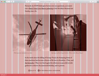
For now I’m using the more straight-ahead grid-column/grid-row syntax and specifying columns and spans explicitly (ex. grid-column: 5 / span 8;). I’ve seen posts pushing developers to skip this and take advantage of grid-template-areas, but my editorial layout brain had a much easier time slipping into Grid without that level of abstraction. And hey, when it’s your site you do what you want.
Apart from moving beyond float as the dominant layout tool, I was able to throw out a bunch of div wrapper elements. Also, dealing with content overflow is a thing in this new flexy-squishy world, as is relearning techniques like how to make full bleed elements break out of smaller containers. After the initial learning curve, I loved shaking off the old approaches and relearning things with the new possibilities these tools offer.
Here again I owe thanks to the A Book Apart series. This time to Rachel Andrew’s The New CSS Layout, for the lessons that got me started. I found myself going back to it multiple times, as well as reference material from Jen Simmons and Chris Coyier’s magnificent CSS-Tricks. (Do these folks ever sleep?)
Like others, I had to cobble together my own “faux subgrid” solution. My site layout is mercifully simple, and I’m able to re-establish the right number of grid columns on child elements without too much fuss, keeping the content inside them lined up with the main page grid. But it did push me to use the same number of grid columns across all viewports for simplicity. There’s nothing wrong with that, but if I had more complex needs the current lack of native subgrid support in browsers would be more of a barrier.
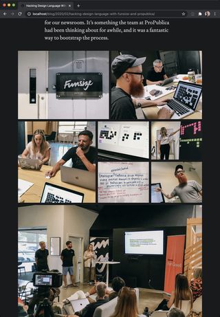
Like my colleague Rob Weychert, I also found the incompatibility of float-like behavior with Grid disappointing. If you work with editorial content it’s a wall you’re going to hit sooner or later. I hope efforts to address it get off the ground.
Speaking of Rob, I have him to thank for putting CSS custom properties on my radar. I’ll admit to not grasping the full potential of custom properties at first, thinking of them mostly as a native replacement for the kind of static variables we already have in Sass. But boy are they capable of much more. Live interpretation and their participation in the cascade made things like adding dark mode support a breeze. There was a moment when I realized I could use them to define theme-able color values inside inline SVGs that blew my mind a little.
I’m a fan of capabilities like this becoming a native part of the browser. Sass and jQuery come from a tradition of practical tools that extend best practices (see jQuery’s use of CSS selectors). And they were built with an opt-in ethos (ex., all valid CSS is valid Sass). Their approach acknowledges that they are not the end in themselves, anticipating native solutions and making it easier to transition to them when they arrive. I can see a moment in the not-too-distant future like that for Sass, similar to the one that already arrived for jQuery. To be clear, I think both will be useful for years to come, but nothing like the must-haves they used to be.
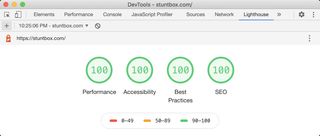
All these changes let me shave a ton of weight off my CSS. Enough that I was comfortable putting all of it right in the head of my HTML instead of linking to it as an external resource (I’ll have more on that in a follow-up post). That got me thinking about performance in a bigger way, and led me to finally implement long-standing wants like http/2 support and a decent lazy-loading solution for images. A few other tweaks later, and I had some front-end performance scores that looked like I knew what I was doing.
As a kid growing up, most weekends were spent alongside an adult helping them fix or build something. Lots of the things being fixed or built needed the work, but plenty of times it was just as much about keeping hands busy and minds engaged.
The work I’ve put in to gently refashion this site is modest but meaningful, done to support an experience that’s simpler and sturdier for me as the maker, and hopefully you as the reader. And, like those childhood weekends, it’s helped this space fulfill its purpose of keeping me engaged and learning while the world spins madly on.
More to come. In the meantime, be well, and stay safe out there.