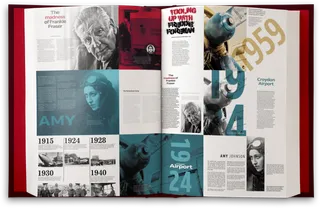
What is Art Direction for the Web?

Andy Clarke has written a wonderful new book about art direction for the web titled, appropriately enough, Art Direction for the Web.
Art direction is core to my day-to-day work with editorial design and publishing platforms, and something many newsrooms spend a fair share of time and expertise on. But it also applies to digital product work, service design, and a raft of other disciplines that might not seem obvious. Andy does a great job teasing out examples and demonstrating how and where the fundamentals of good art direction apply to them. He also includes case studies and hands-on technical walkthroughs for web designers looking to up their skills.
I spoke with Andy early in his writing process for this book—as did fellow ProPublican Rob Weychert—and took a turn on his podcast talking about some of the work I’ve overseen at ProPublica. I’m delighted to have several of our projects featured in the finished product.
ProPublica is unique when it comes to art direction. We co-publish many of our biggest stories with other venues, which often means the same piece will appear on more than one website at the same time. But we don’t require everyone use the same presentation. We allow space for partners to tailor things to fit their own larger design and technical considerations. That means it’s not unusual to end up with two or more approaches to the art direction for the same story. Sometimes they’re similar, sometimes they’re really quite different, and I love seeing them all.
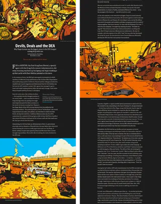
The opening example from Andy’s book highlights one of those cases. In 2015, we partnered with The Atlantic for David Epstein’s dramatic story about one of the DEA’s longest-running drug cartel cases. In terms of conveying tone, the story presented something of a challenge.
After talking with David about his reporting, we knew we needed to signal to readers that this was a violent, chaotic story about violent, chaotic events (I believe the term I used was “fucking insane”). But we wanted to do that without immediately throwing photorealistic acts of gore or violence at people. To pull that off we turned to Tim McDonagh, a true talent known for his vivid, phantasmagoric style of illustration. Our intent was—to put it bluntly—to create the kind of opening that would make readers sit up in their chairs and say, “Holy shit.”

This wasn’t just about shock value though. Good art direction, especially the bits readers encounter first, is about making a space so people hear what comes next. It prepares the audience. We wanted the reader to be cued up for the dramatic tale that was about to follow. I’m biased, but I think we pulled it off.
Over at The Atlantic, their team went with a layout that emphasized historical and evidentiary photography. It’s an approach that defers emotional urgency in favor of a newsier documentary feel, and it works great too. Both are valid approaches and in line with what the audiences for either site might expect. More importantly, both are great examples of the places you can take content with meaningful art direction.